

 Now we need to colour them. The colour needs to be transparent, so a dye based colour or watercolour or even very dilute artists acrylic should work. I use Brusho which is a fun little pot of dye based powder colour which you can get all sorts of interesting effects with. To get the shade of blue I like, I use the black (yes, black!) Brusho, mixing a sprinkle of powder with lots of water to make a very dilute colour. I can't tell you how much of each because I don't measure it, I literally do just sprinkle. But for this, the more watery the colour the better, you can always add another darker coat later. The idea is that the colour from the base paper should show through just enough to make it interesting.
These have had a wash of the dilute colour applied. You can still see the underneath coloured paper a bit too much but don't be tempted to add more colour, they will tone down as they dry. If you still don't like the effect once they are dry, by all means add more colour then. And of course, you don't have to use blue, you can use whatever colour you like!

And here they are nearly dry - you can see that the underneath colour has toned down a lot and the wrinkles in the tissue paper soak up the top colour to make darker streaks.
 When they are completely dry they will probably curl up again. At this point I just flatten them with a cool iron.
Take a look at your work. Do you like the way the base paper shows through? One of my pieces (bottom left) had a very definite line down it which I didn't like, so I sponged some white acrylic paint over it and voila, no more line!
If you are making a bigger piece I would definitely recommend sponging some areas with acrylic paint in your choice of colour to add interest.
 Once that has dried we get to the really fun bit - adding all the little bits of texture on top. It helps if you have amassed a collection of interesting bits and pieces like I have, but really, anything will do. Silk fibres work nicely, but so do threads pulled from the edge of fraying fabric. I love plasterer's scrim but I have also used shredded pieces of the netting bags that you get fruit in.
Here's a selection of what I use - there are some silk fibres in there and the sparkly stuff is Angelina but a lot of them are just scraps - whenever I cut the edge off something and it's the right colour scheme for my cards it goes into the box. And I save the little tangle mess of thread ends that accumulate when I'm doing a sewing project... sad, I know... I have heard that lint from a tumble drier is interesting but I don't have one. Probably just as well!
So what I do is look at the background in front of me, look at the box of scraps, pull out something that looks like it might work and stick it on. I like to use acrylic matte medium to stick the bits because it doesn't leave a shine and seems to stick pretty much anything. You could use PVA, that does tend to make the paper a little shiny, it depends on the effect you are after.
 |
| Nearly finished... |
Once I've stuck something on I decide whether that's enough, or I might stick another piece of something on. Or I might spray or spatter it with some ink - pearlescent is nice. And because I am working with a seashore theme, on most of my pieces I add a little puff paint because I think it looks like flecks of foam. Puff paint is weird stuff that expands and puffs up when you heat it with a heat gun, but he warned, less is more! It's very easy to obliterate the whole thing with little white blobs!
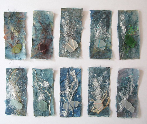
And here are the finished pieces, complete with puff paint on some and each with their own piece of sea glass.
I have shown you how I make the toppers for my cards but I originally developed this technique for a series of much larger pieces (sorry the photo is a bit dark - do click to see it bigger).
 | ||
| Sea Strand I |
If you are working on a larger scale than the cards and want to include a lot of stitching on the piece I recommend you back it with an iron-on interfacing for extra strength. It's best to do this before you add puff paint if you are using that, otherwise it can get a bit flattened.
And there you are! If you have any questions, do leave them in the comments below and I will try and answer them. And if you do try it out, I'd love to see what you make!
Brilliant tutorial, well done :) Covers everything and nice to see lots of lovely photos of your work !
ReplyDeleteWow. Lovely finished pieces. :o) Great tutorial.
ReplyDeleteWonderful stuff. Thanks so much Helen.
ReplyDeleteThe larger piece is gorgeous, I thought at first it was driftwood but I guess even you would have trouble sewing into wood. I really like the hints of base colour peeping through, very effective and of course reminds me of the many many shades of the sea. Thank you.
ReplyDeletethese are beautiful! thank you for the tutorial, I will have to try this technique. I enjoyed visiting your blog. warm wishes, Susanne
ReplyDeleteThank you Susanne! Have fun with it!
Delete.. you work is beautiful.
ReplyDelete